interface

Kramer - Session manager

Context and Goal

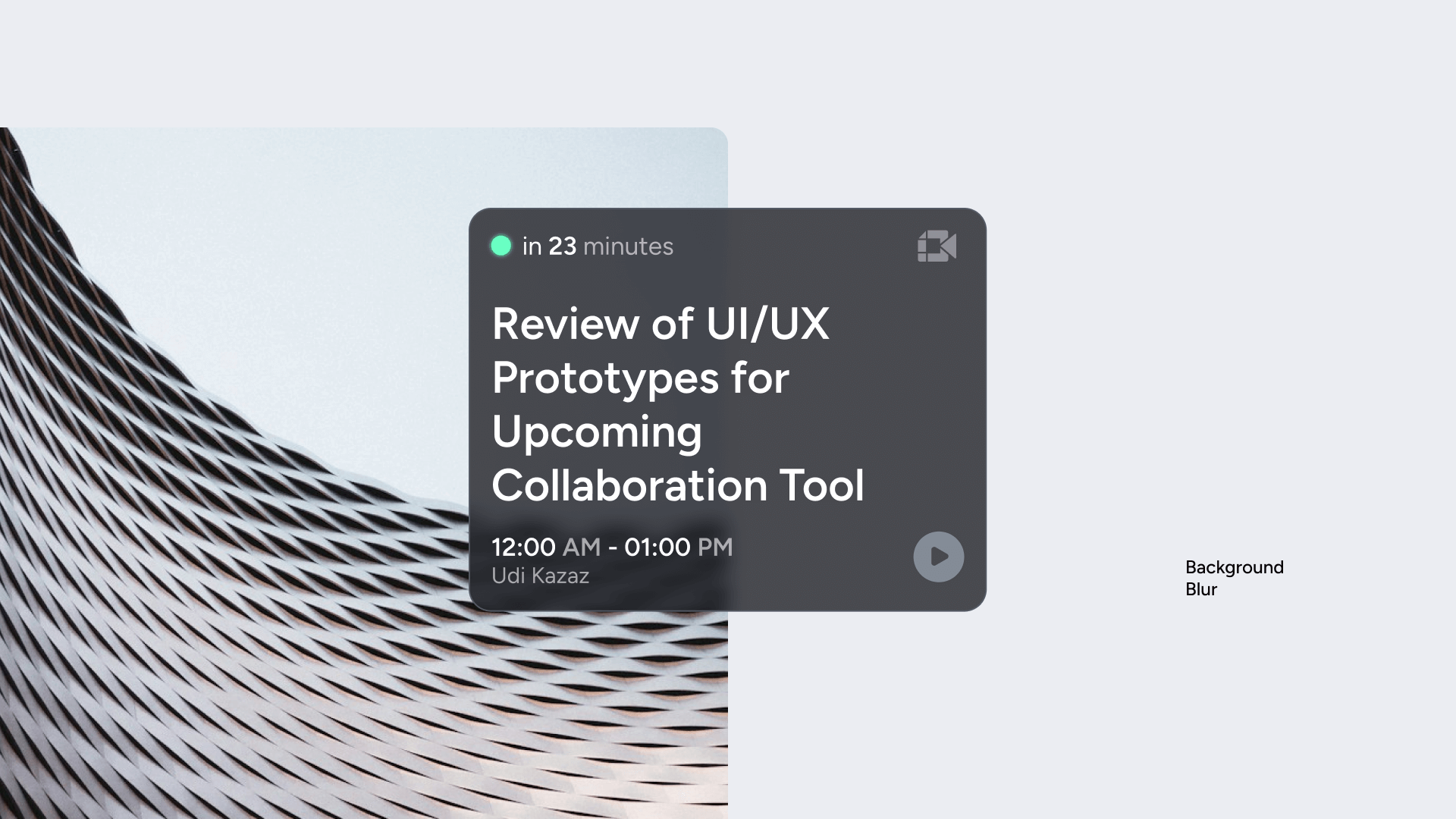
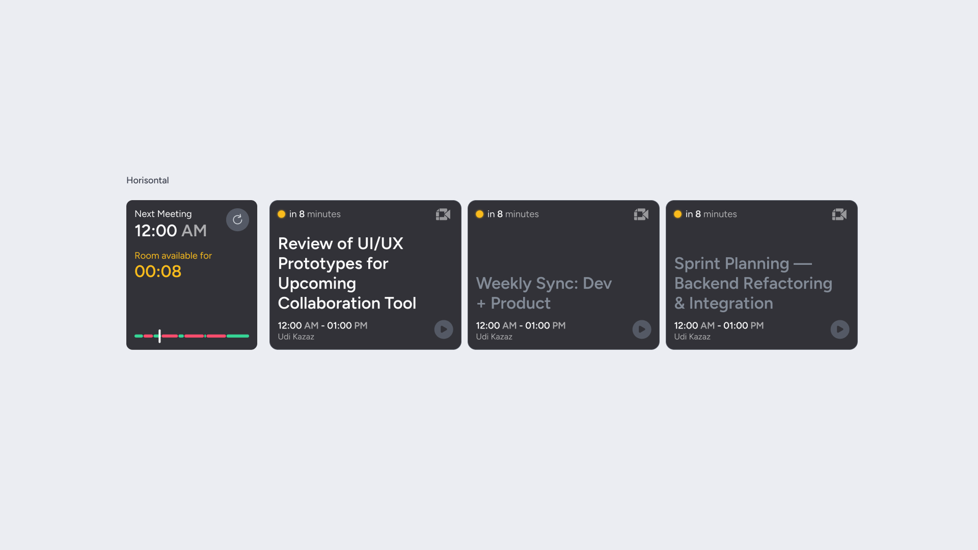
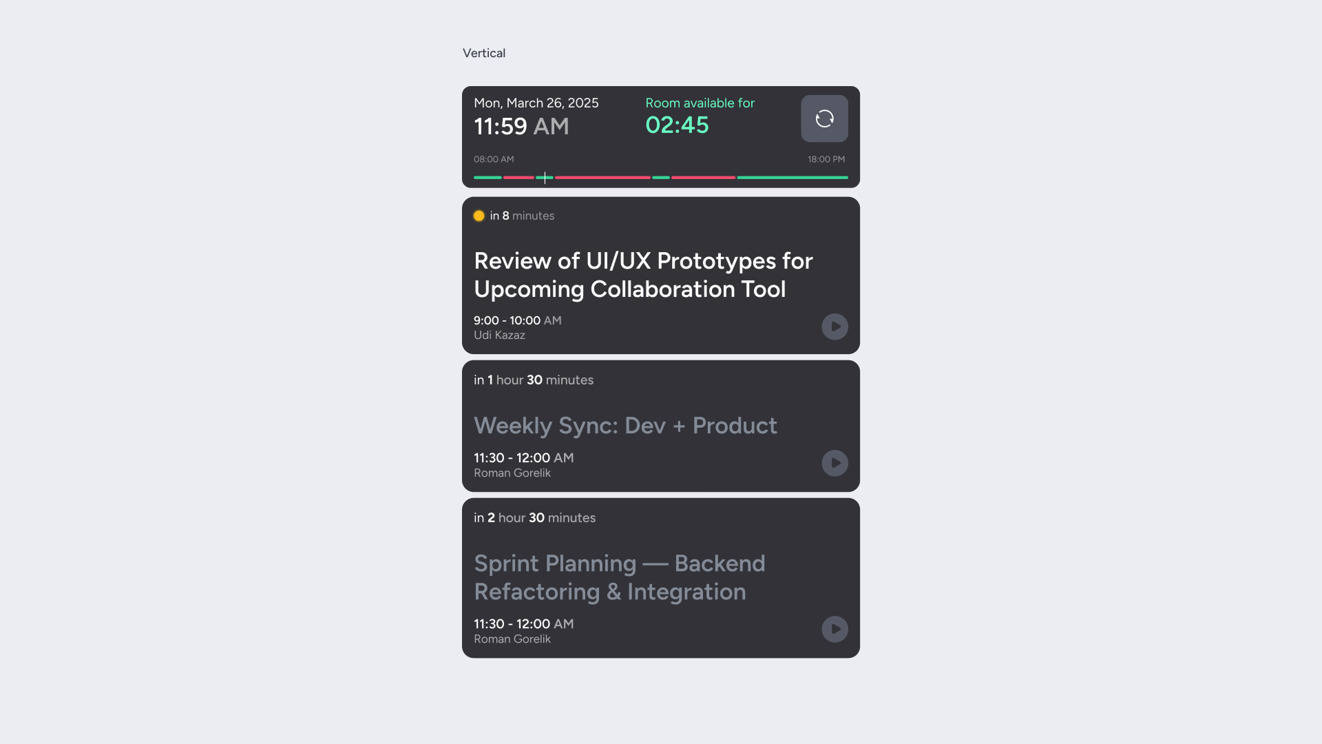
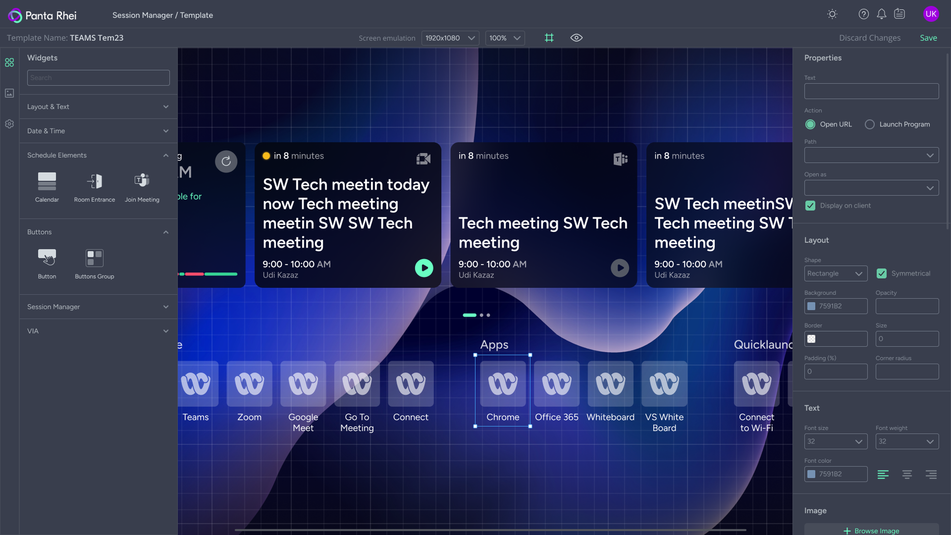
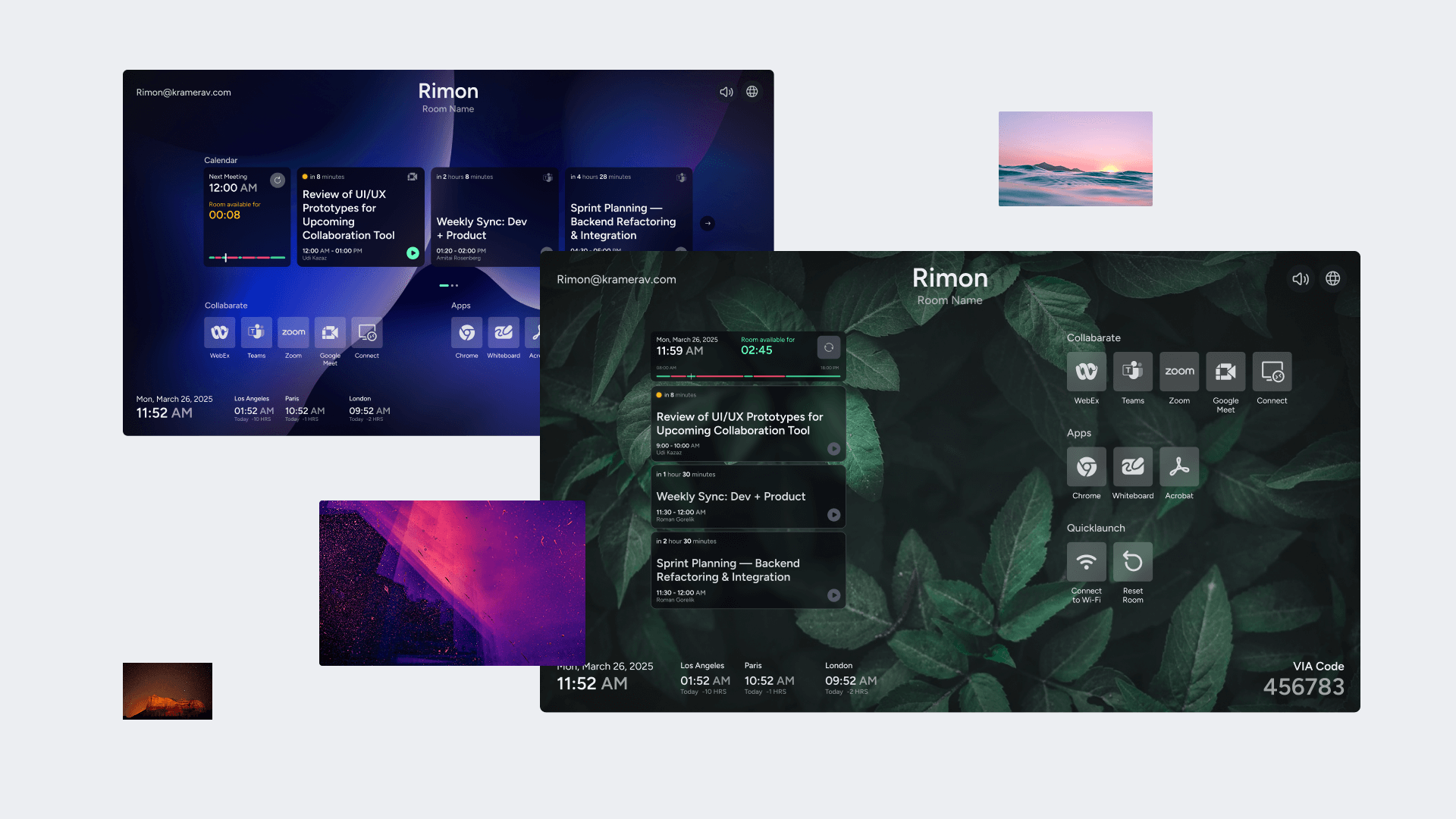
Session Manager is a visual layout editor for screens in meeting rooms, offices, schools, and universities. It lets users build screen layouts using widgets like calendars, clocks, and buttons, which are then shown on physical screens in real spaces. Our company acquired a startup that built the early version of this tool, and we improved and integrated it into our system.

Target audience:
Integrators who set up Kramer equipment for companies

IT departments in large companies (like American Airlines) that manage device infrastructure

Educational institutions (schools and universities) that use interactive screens in classrooms and halls
Problem:

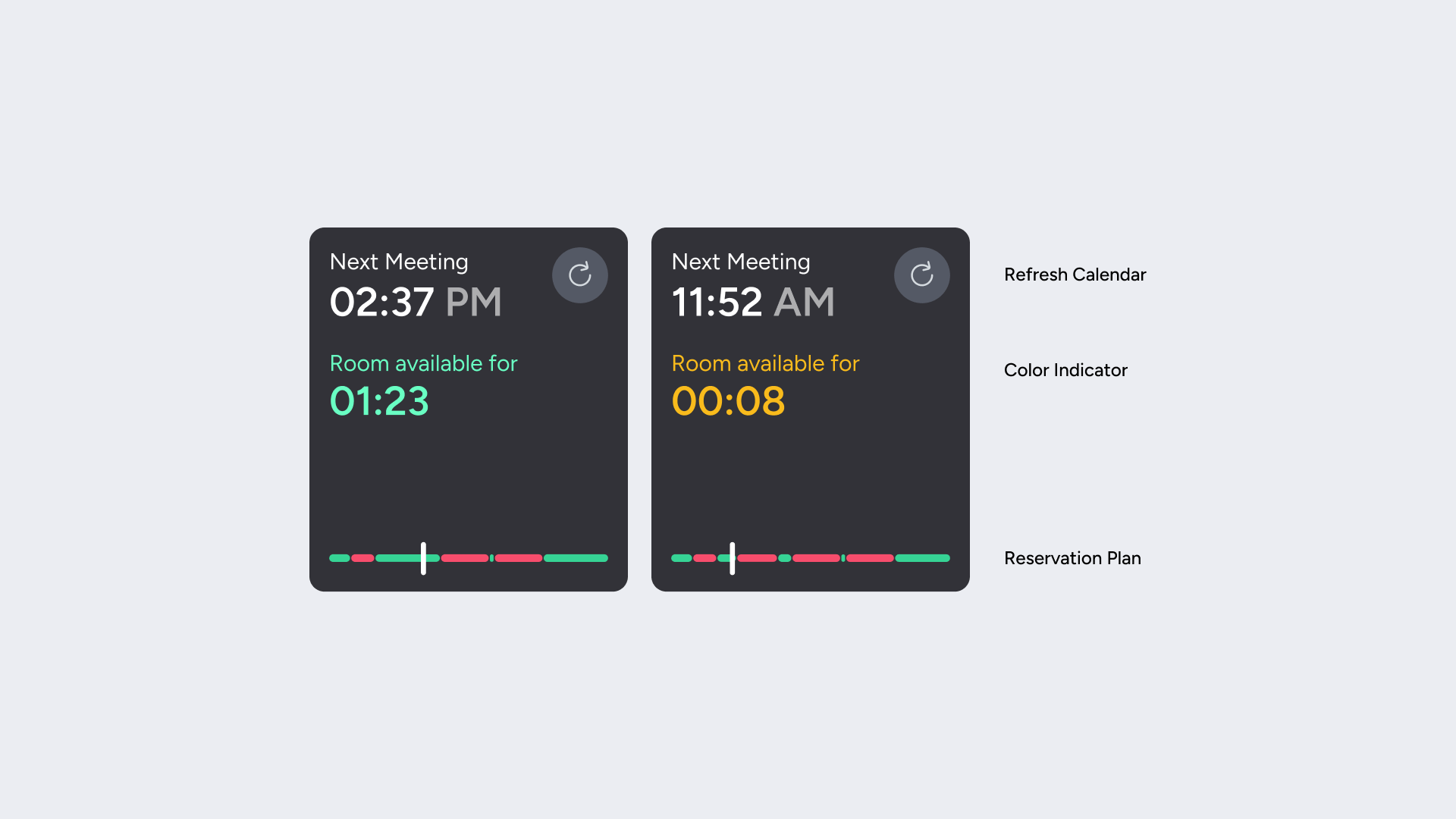
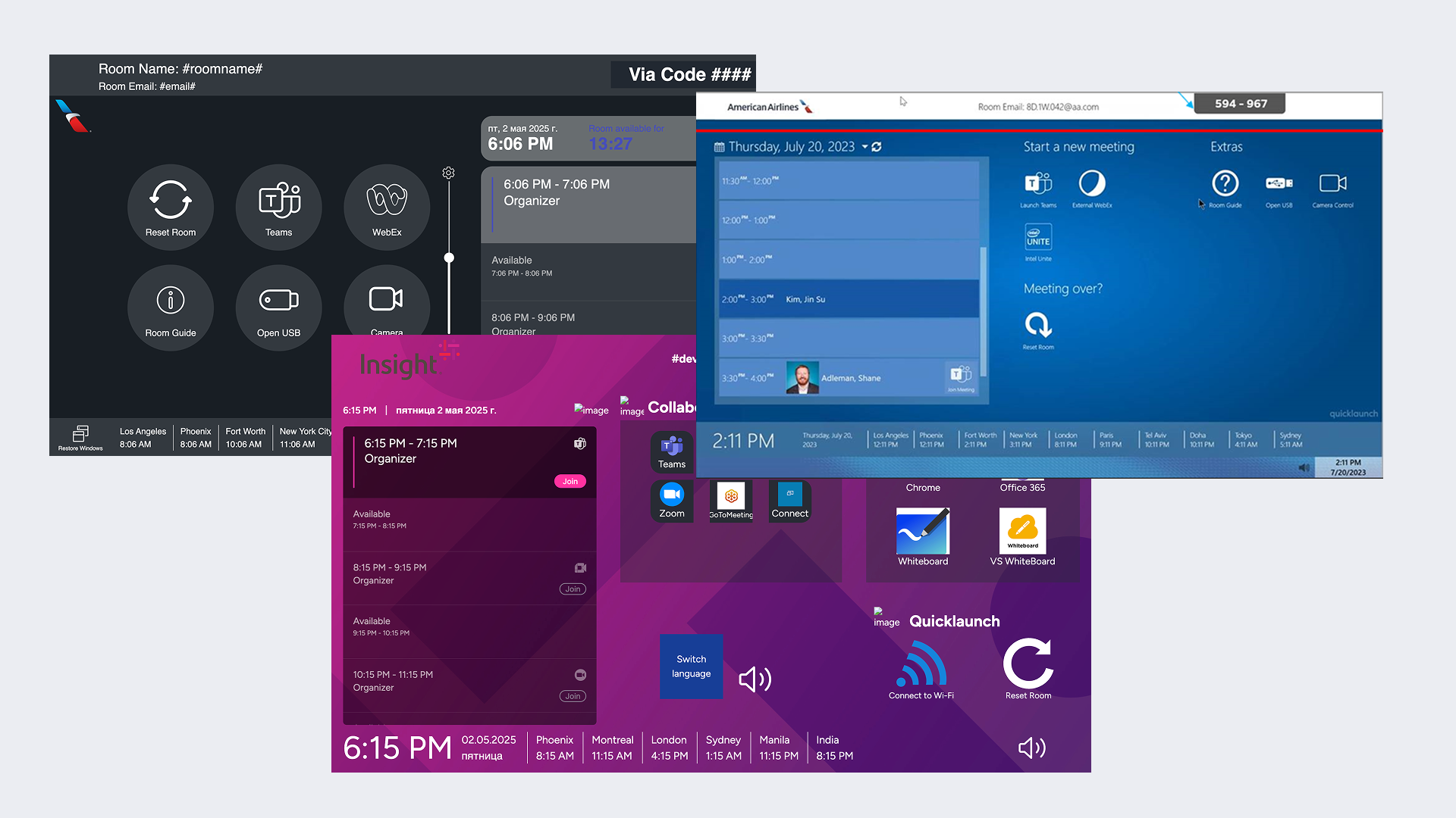
Before, most meeting rooms had simple TVs or screens connected via HDMI. While rooms could be booked through an app, there was no way to see booking info in the room itself. Users could send audio and video through Kramer devices, but couldn’t control what was shown on the screen or customize the layout.

We needed 
a tool that would
Keep everything within the same hardware + software ecosystem

Let users build screen layouts for each room or client

Compete visually with tools like Microsoft Teams Rooms by offering more flexibility and better design
My responsibilities:
Worked as the UX/UI designer

Wrote and reviewed user stories with the customer success team

Created user flows and described widget behavior

Designed prototypes and UI in Figma

Held design reviews and supported handoff to developers
Limitations
From a UX side: we couldn’t give too much freedom, or users might create messy interfaces — but we still had to support many real scenarios so that layouts would work well for everyone
Research and Competitor Analysis

To better understand the needs of our users and define what makes our tool different from others, we collected insights from multiple sources and carefully studied the market.

Data sources:
Feedback from customers via support and success teams

Competitor analysis: Microsoft Teams Rooms, Zoom Rooms, and others

Review of the original startup’s product (called Quick Launch)
Key findings:
Most tools offer only 1–2 widgets (usually just a calendar)

Users want to show more info (clocks, action buttons, branding)

Flexibility is important, but the interface should guide the user — we needed smart templates and limits to help users avoid errors and create clean layouts
Solutions and Design Process

To turn insights into a real solution, I focused on creating an intuitive design process that balanced user freedom with consistency. Here's how we approached the design and implementation:

Customization
A free icon library API with thousands of consistent-style icons, so users could choose icons without uploading custom assets

The Unsplash API to let users select high-quality background images for their screens
Design process:
At first we considered fixed layout templates, but stakeholders insisted on drag-and-drop freedom

I proposed a hybrid solution: allow free placement but use snap-to-grid, visual hints, and size limits to keep things neat

Each widget had properties (color, behavior, alignment)
Results

After implementing our design and completing the development process, we evaluated the outcome based on how well the solution met the goals of the project and the expectations of users and stakeholders.We successfully delivered a well-balanced solution that met both user expectations and technical constraints:

Key achievements
Built a flexible and user-friendly layout editor

Integrated into the Panta Rei product, now used in real installations

Sold as a separate Session Manager module — sales tracking is ongoing

Customers liked the simple setup process and clean visual results (based on informal feedback)
Next
Portal pro - house handyman services