We transformed a local handyman service for 70,000 apartments in St. Petersburg into a scalable digital product. By rethinking the customer and handyman experience, integrating CRM and apps, and improving the website, we reduced request handling time by 32% and built a reliable, modern service for residents.
Initially, the management company serving many residential buildings in St. Petersburg had its own handyman service for 70,000 apartments. Our task was to modernize this service and transform it from a local company into a product ready for scaling to other cities.
Both groups are dissatisfied due to the lack of an integrated system.
Before, most meeting rooms had simple TVs or screens connected via HDMI. While rooms could be booked through an app, there was no way to see booking info in the room itself. Users could send audio and video through Kramer devices, but couldn’t control what was shown on the screen or customize the layout.
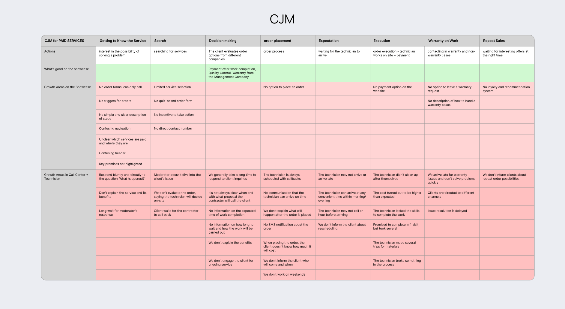
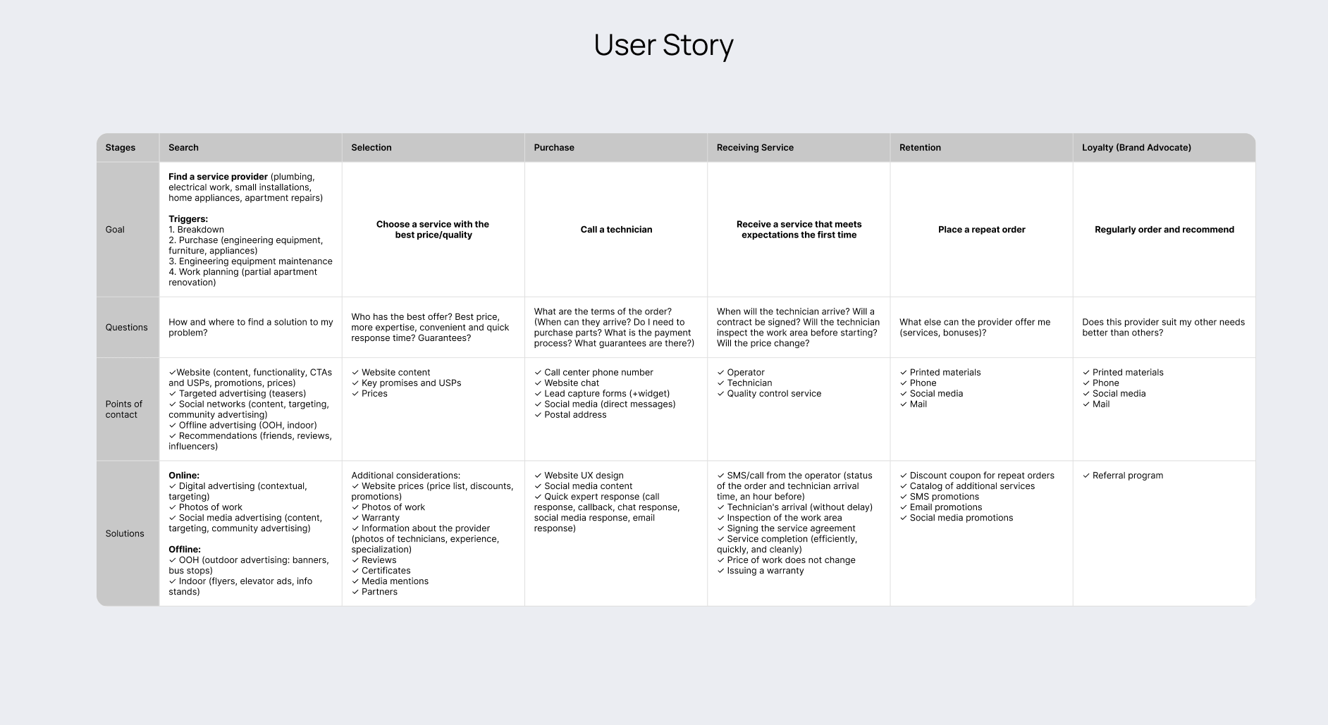
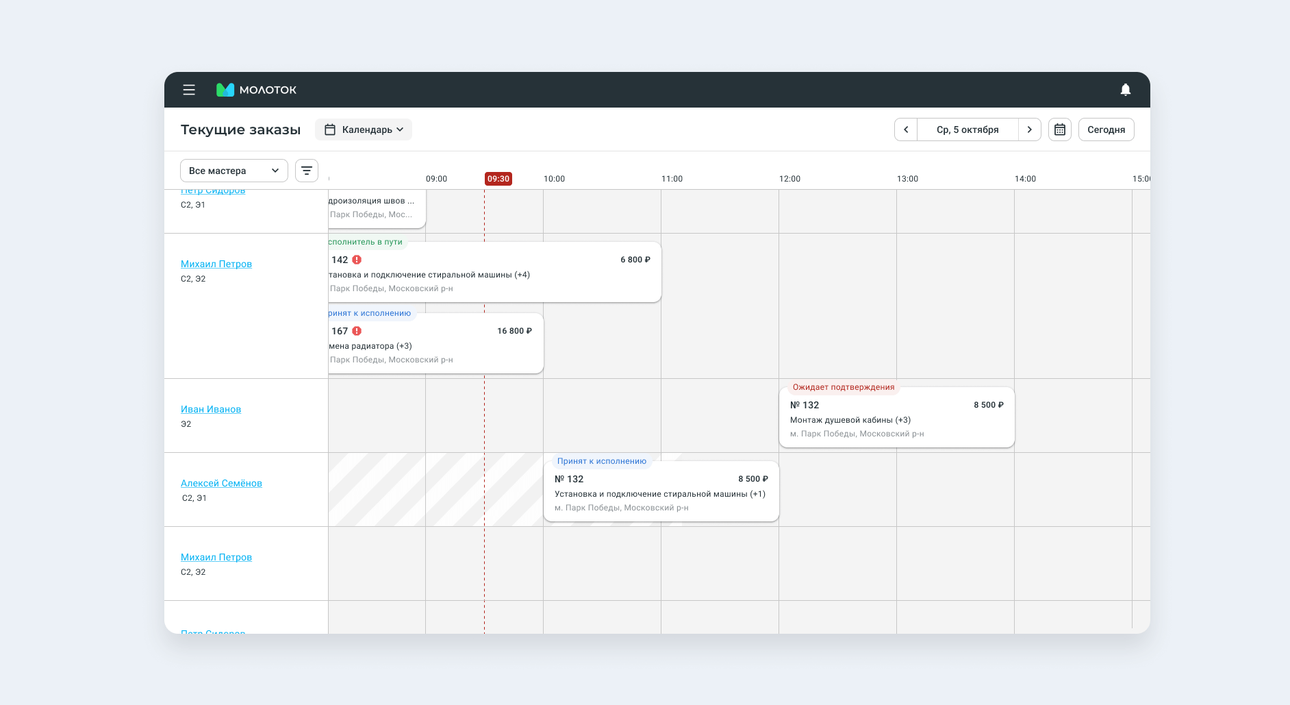
To address these frustrations and unify the experience for both customers and handymen, we needed to completely rethink how the service worked. We started by carefully mapping the entire handyman process — from booking to job completion — and identifying where confusion and inefficiencies happened.
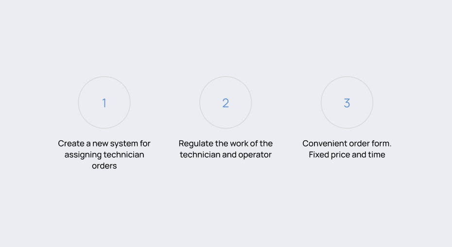
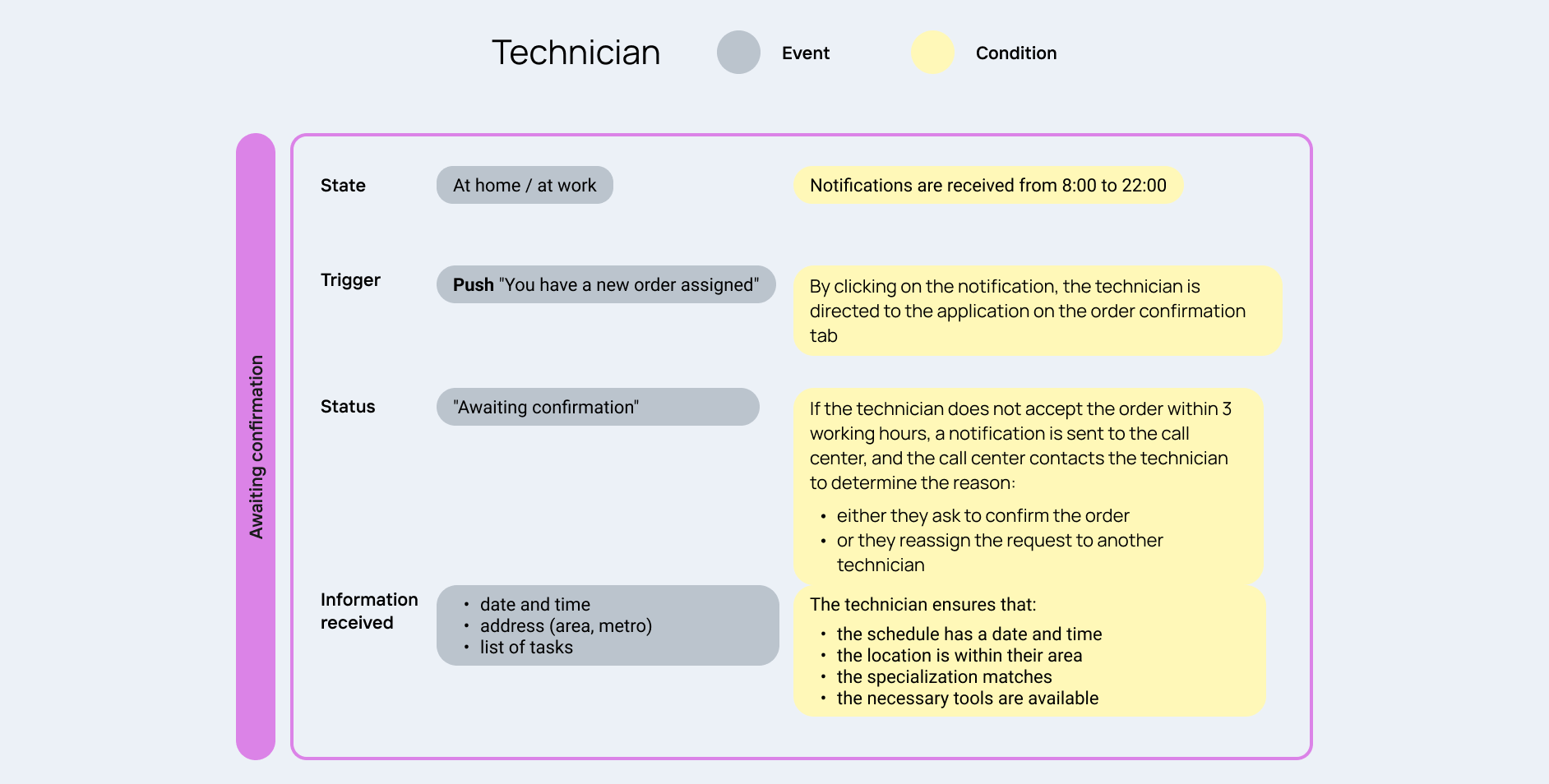
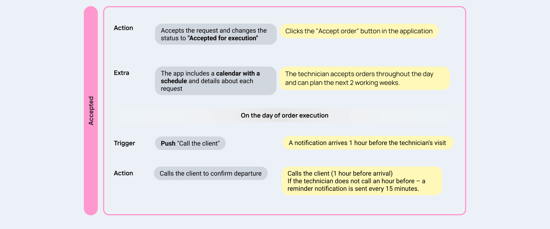
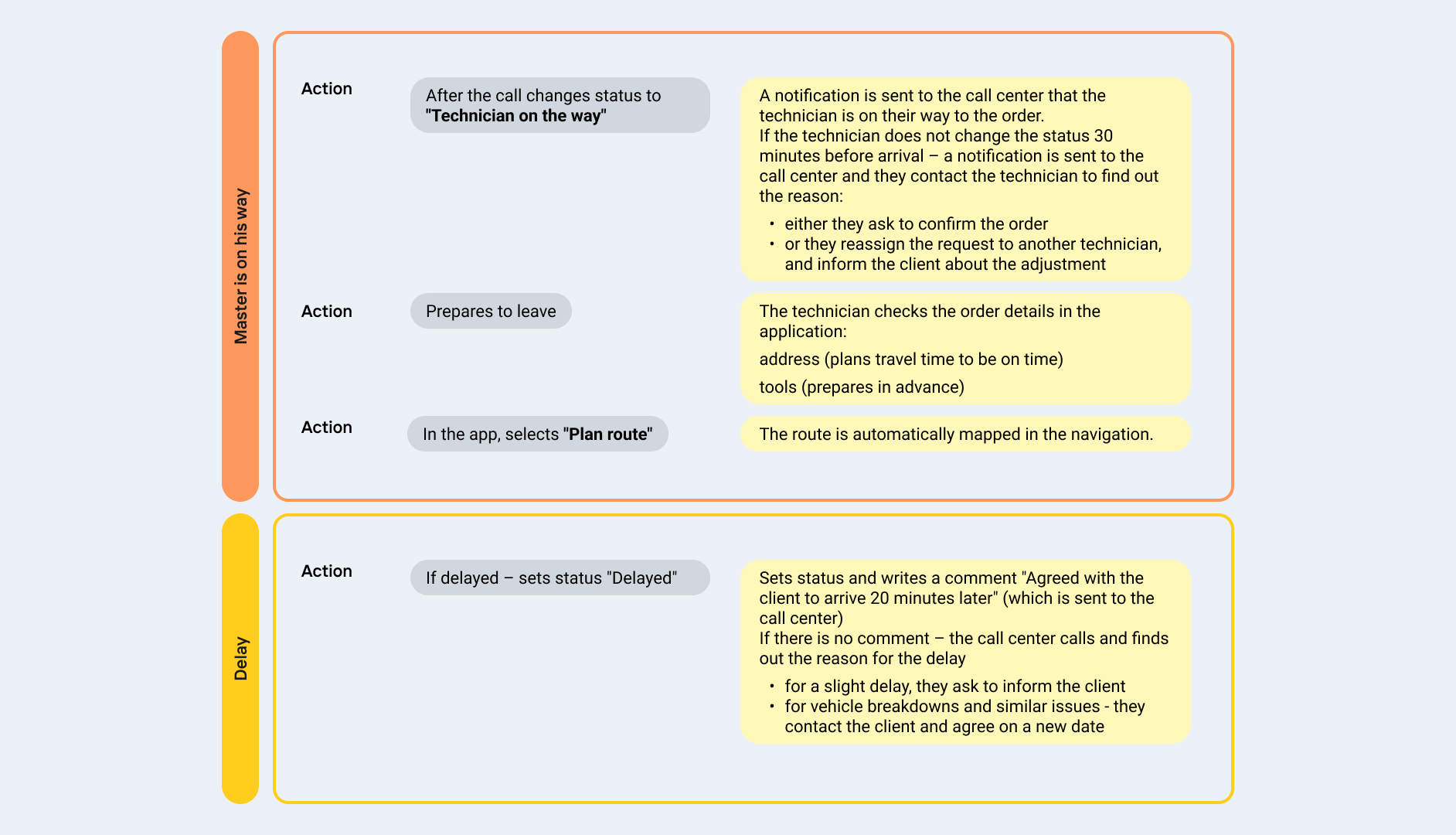
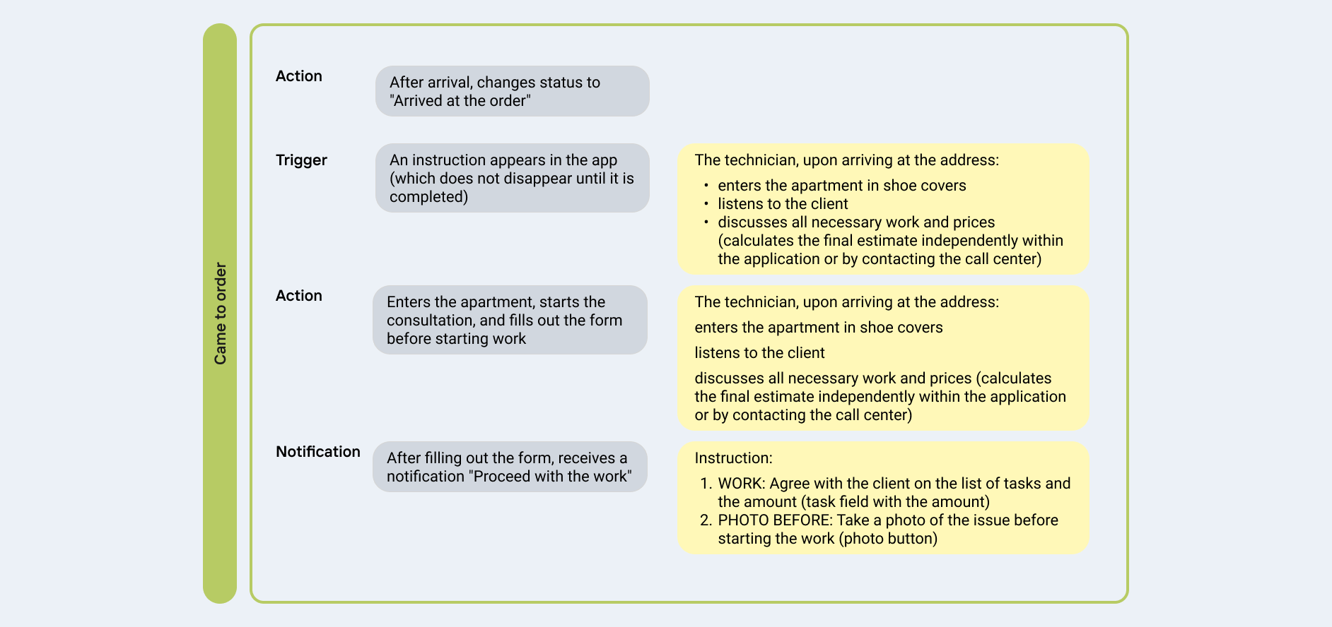
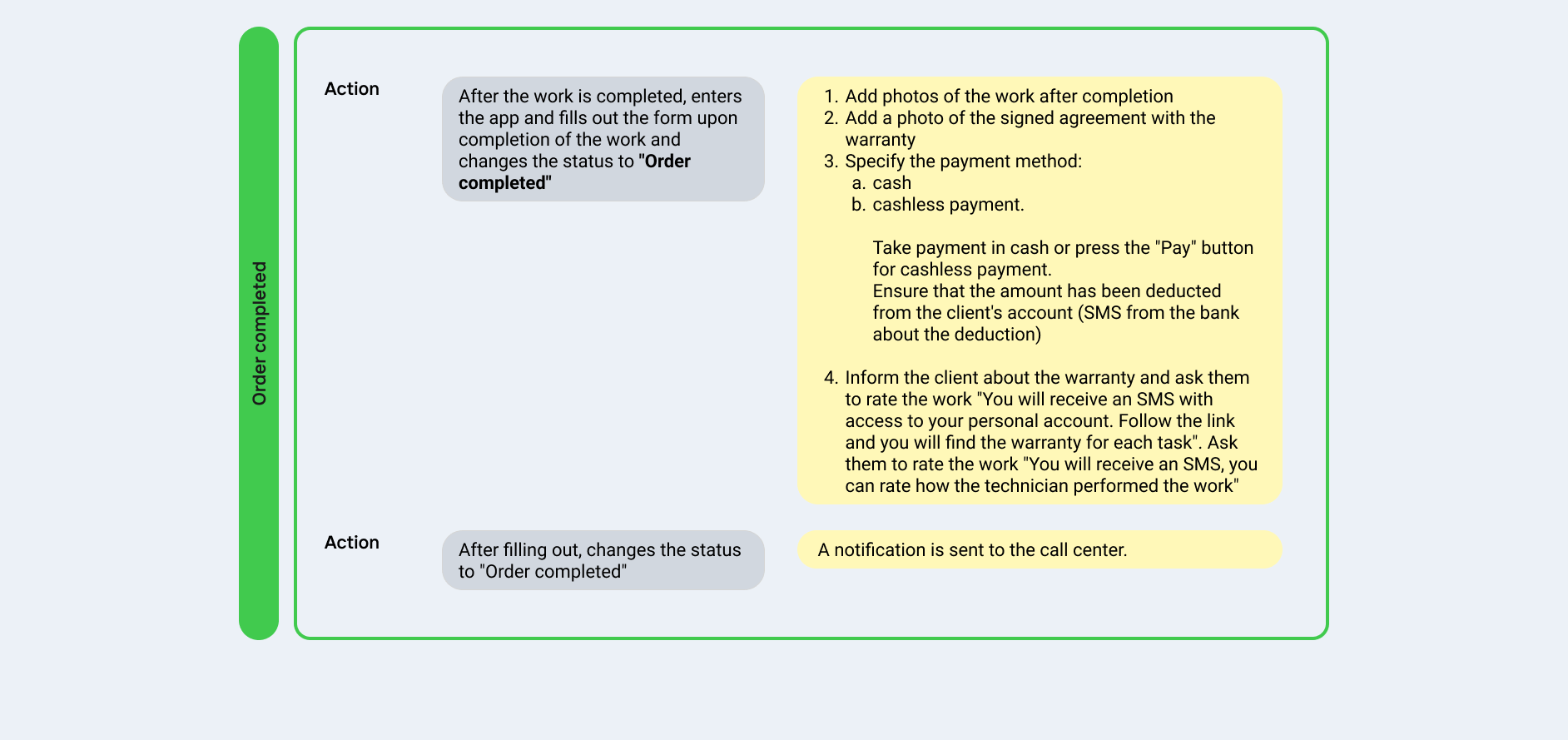
After a month of testing and collecting feedback, we began developing separate applications for handymen and operators. In parallel, we developed a CRM system, taking an existing third-party service (Elama) as a basis. Because we already had a reference and a list of needed features, we knew what was convenient and what wasn’t
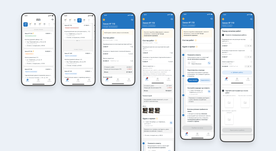
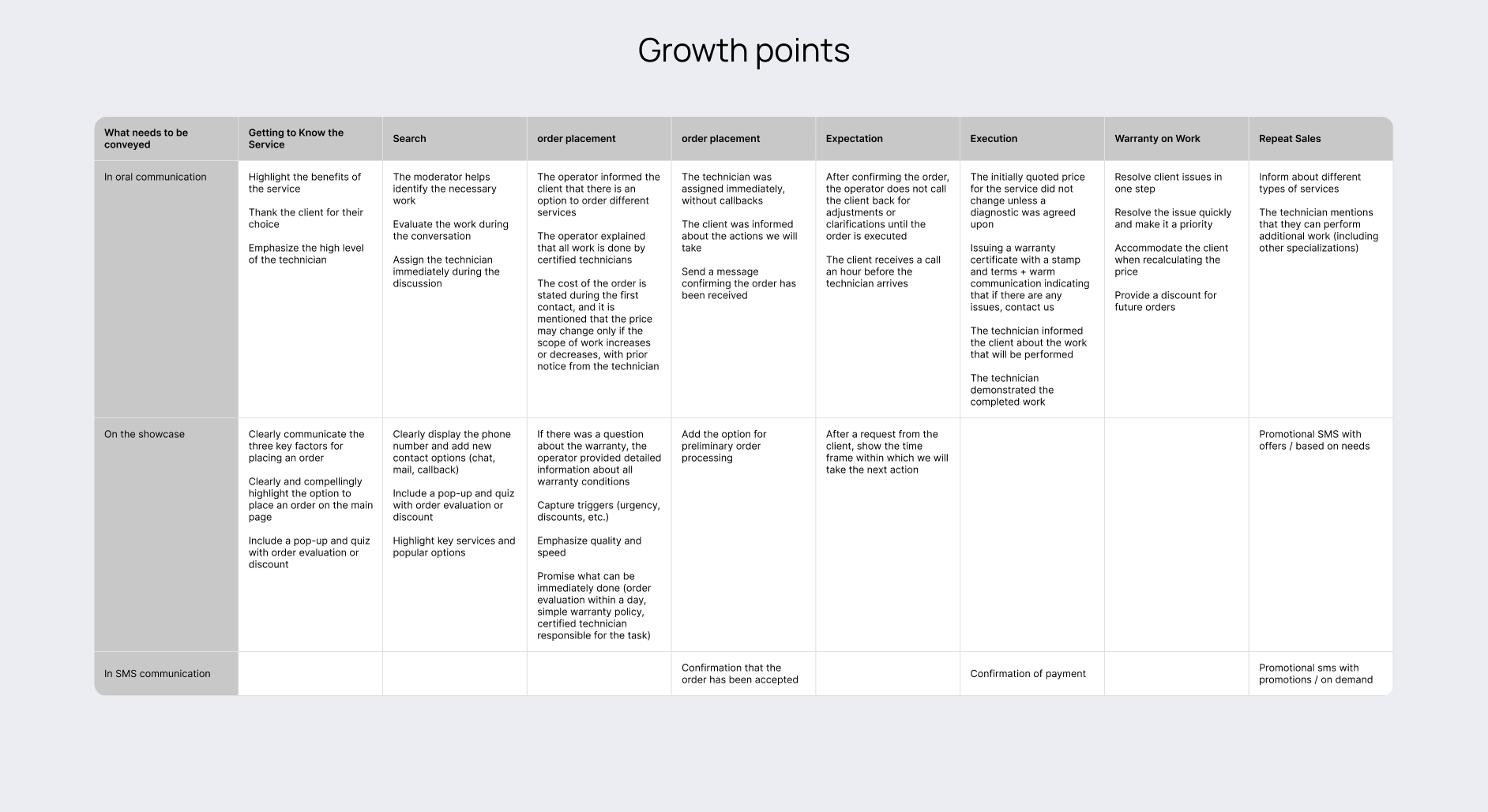
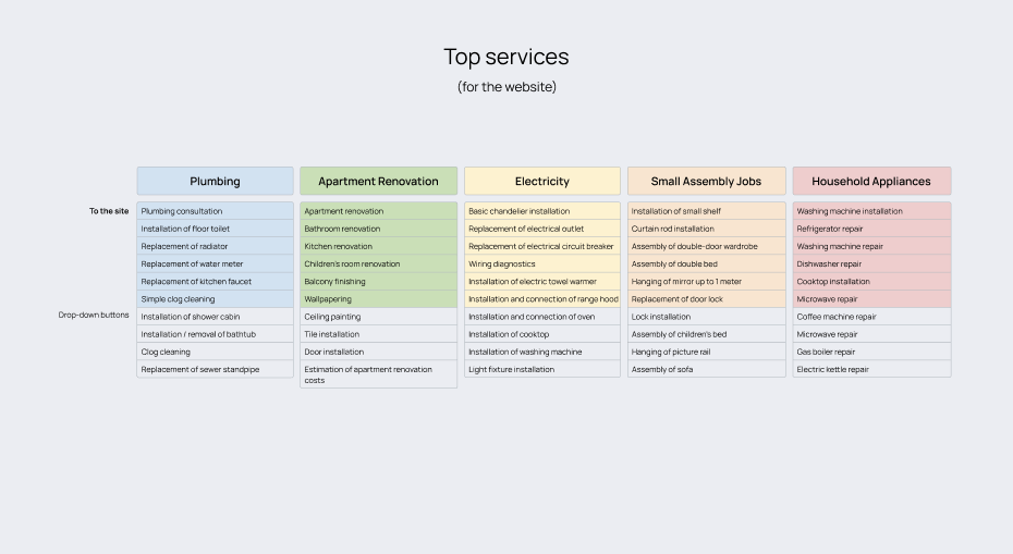
Once the internal system for the handyman and operator was ready, we focused on the customer side. We redesigned the main page to highlight the service’s main advantages.
Particular attention was paid to the order form. While creating it, several imperfections of our CRM system were discovered and refined. For many services, we provided up to five different descriptions, so that users could always find what they needed and explain it in their own words. The order form was tested with a closed group for two months before being made available to all users.
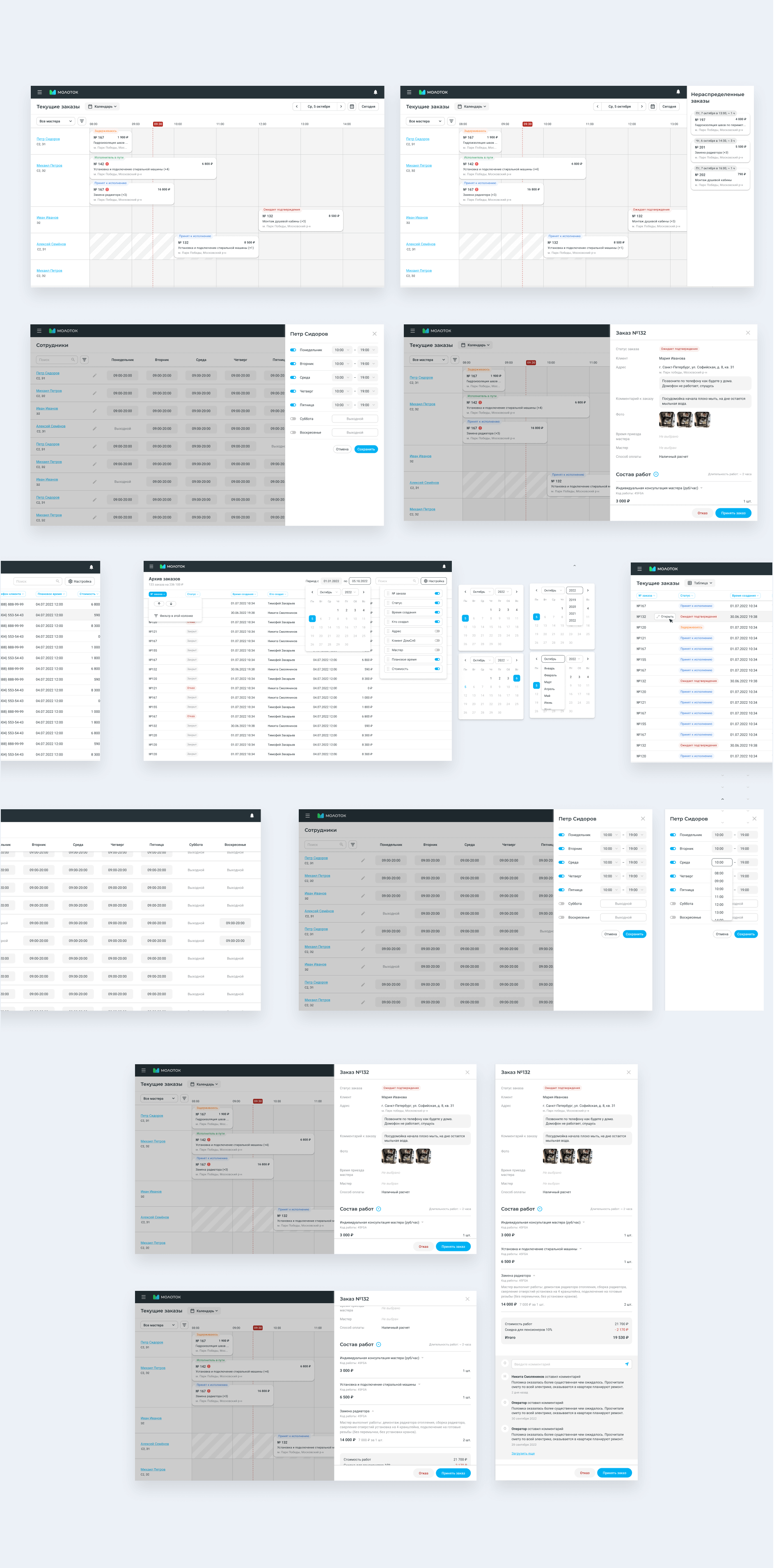
After the new system was introduced, we measured the impact using Jira and saw that average task delivery time decreased by 18%. Developer questions to designers dropped by 42%. The development team highlighted how much easier it was to use the tokenized components and reference the new, structured library.
I created a master Figma file for the team with the full structure of tokens, color systems, components, and usage guidelines. I also gave a presentation to the whole team, highlighting the benefits of the new approach:
This project was a major challenge in systematizing a chaotic product. I not only solved the visual inconsistency but also built a foundation for fast and precise interface scaling.
A true design system isn't just about buttons — it's about creating order in the team and the product. I began by gathering all the colors used in Figma and the product, documenting the old palette, analyzing it, and then proposing a new system that would be easy to scale and maintain. I started by creating a structured grayscale palette and then built a three-layer token architecture: Brand (base values), Alias (by purpose — error, primary, neutral), and Mapped (by application — text, surface, border, icon).