interface

Design System for Panta Rei

Problem

When I began working on the design system for Panta Rei, the product had already become a complex structure made up of many modules, each developed independently. Components in Figma, Storybook, and the actual product interface looked different, lacked shared logic, and were often duplicated. Every new feature introduced its own variations of existing elements, which led to design inconsistency, confusion in development, and an overall fragmented user interface.

Limited Neutral Palette
The neutral color palette consisted of just a few basic shades of gray, which made it impossible to build proper hierarchy and visual accents.
Issues with the Light Theme
The light theme was developed later as a secondary option. It had low contrast and many issues with color hierarchy
No Clear Color Purpose
Colors were used inconsistently — the same shade might appear as text, icon, and button background. In Figma, colors were set as static styles instead of variables, making them visually uniform but hard to manage. Any change caused unpredictable effects. Without clear color roles, maintaining and scaling the interface was difficult
Objective

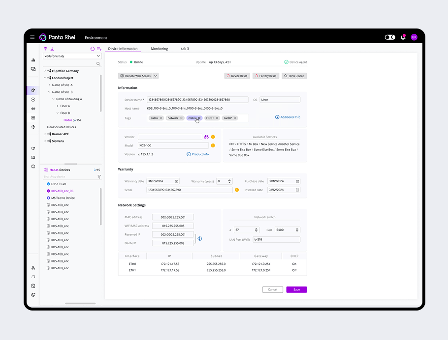
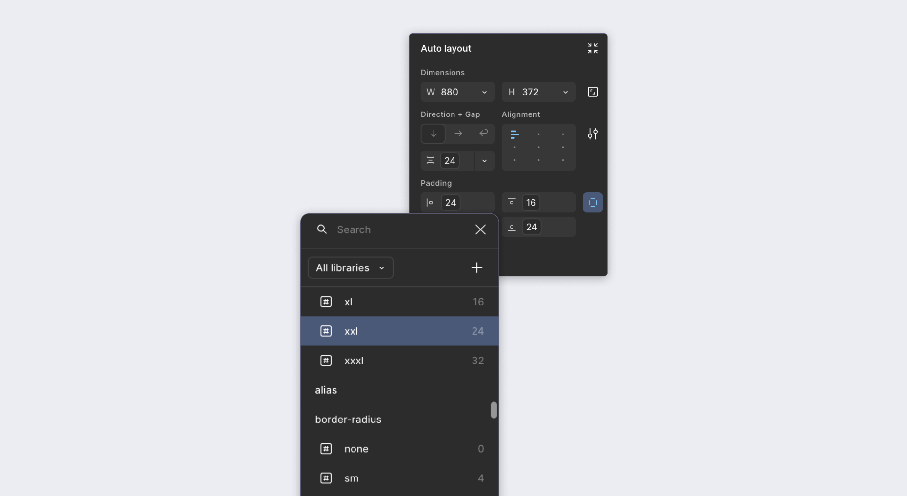
My objective was to bring order to the system: to collect all existing colors, document the outdated palette, analyze it, and then offer a scalable and maintainable structure. I also had to redesign the light theme, unify and standardize the component approach, and build a token architecture that would make the product faster and more consistent to develop.

Steps and Key Solutions
Analysis and Palette
I began by designing a new neutral palette, where the grayscale gradations allowed for clear visual hierarchy and emphasis.
Token Architecture
Next, I built the token architecture using a three-layer model:
  • Brand — base colors and their weights
  • Alias — functional roles (e.g., primary, error, neutral)
  • Mapped — interface-specific uses (text, surface, border, icon)
This allowed us to reuse a single color safely across multiple contexts without causing cascading issues when updates were made.
Redesigning the Menu and Icons
As the work progressed, it became clear that the visual design of the menu and icons also needed a refresh. I redrew all the icons manually in a unified style and redesigned the menu from scratch. This allowed us to move away from mixed icon libraries and establish a consistent visual language across the interface.
Spacing and Typography Tokens
The next step was creating tokens for spacing, padding, and text styles. I structured them so that components could be adjusted flexibly without hardcoded values. This allowed us to apply consistent sizing and alignment rules across the system while supporting variation where necessary.
Component Library Redesign
With the token foundations in place, I moved on to rebuilding the component library. Previously, a single component such as Input existed as several disconnected versions — with a label, without one, with an icon, or inside a dropdown — none of which were related in structure or logic. This fragmentation made updates and scaling difficult.I created a single, customizable base component that could support various states and configurations. All visual parameters — padding, font size, colors, border radius — were driven by the token system. Dropdowns, for example, became structured extensions of the base Input component rather than standalone elements. This dramatically simplified both the design and development process.
Evaluating the Results

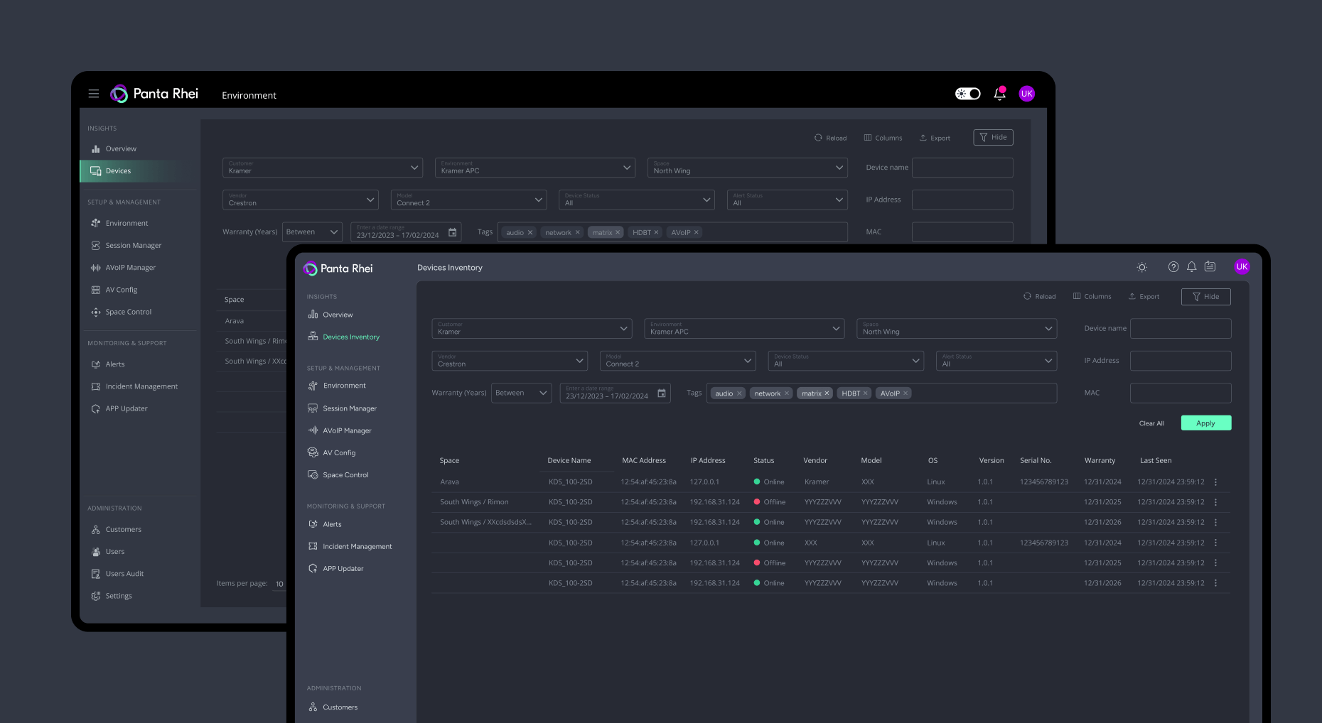
After the new system was introduced, we measured the impact using Jira and saw that average task delivery time decreased by 18%. Developer questions to designers dropped by 42%. The development team highlighted how much easier it was to use the tokenized components and reference the new, structured library.

Documentation and Team Presentation

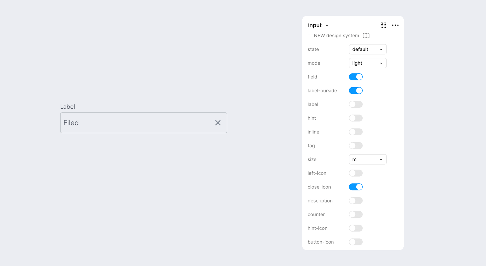
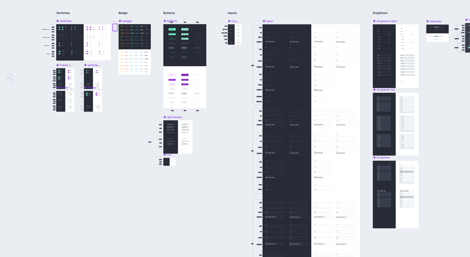
I created a master Figma file for the team with the full structure of tokens, color systems, components, and usage guidelines. I also gave a presentation to the whole team, highlighting the benefits of the new approach:

  • no more hardcoded sizes and colors
  • unified token usage rules,
  • consistent visual logic and scalable infrastructure.
Conclusion

This project was a major challenge in systematizing a chaotic product. I not only solved the visual inconsistency but also built a foundation for fast and precise interface scaling.

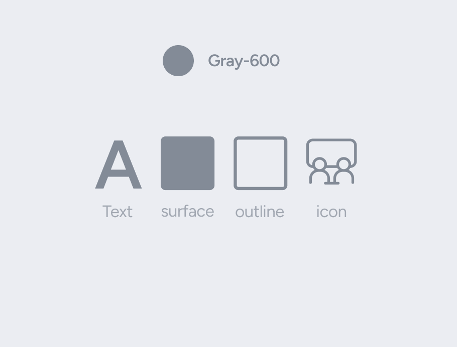
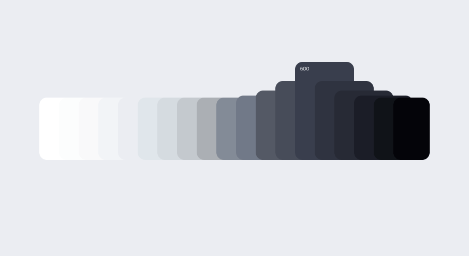
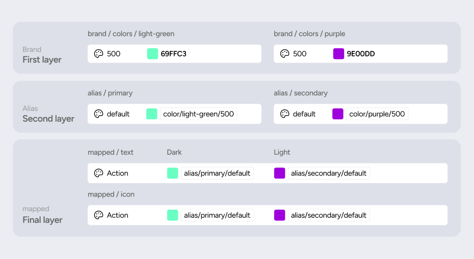
A true design system isn't just about buttons — it's about creating order in the team and the product. I began by gathering all the colors used in Figma and the product, documenting the old palette, analyzing it, and then proposing a new system that would be easy to scale and maintain. I started by creating a structured grayscale palette and then built a three-layer token architecture: Brand (base values), Alias (by purpose — error, primary, neutral), and Mapped (by application — text, surface, border, icon).

Next
1618 Room